Chart Settings and Formatting
After running a report, use Chart Settings to customize how data is displayed — axis labels, number formatting, line styles, reference lines, and more. Access these settings from the Chart settings tab above the chart.
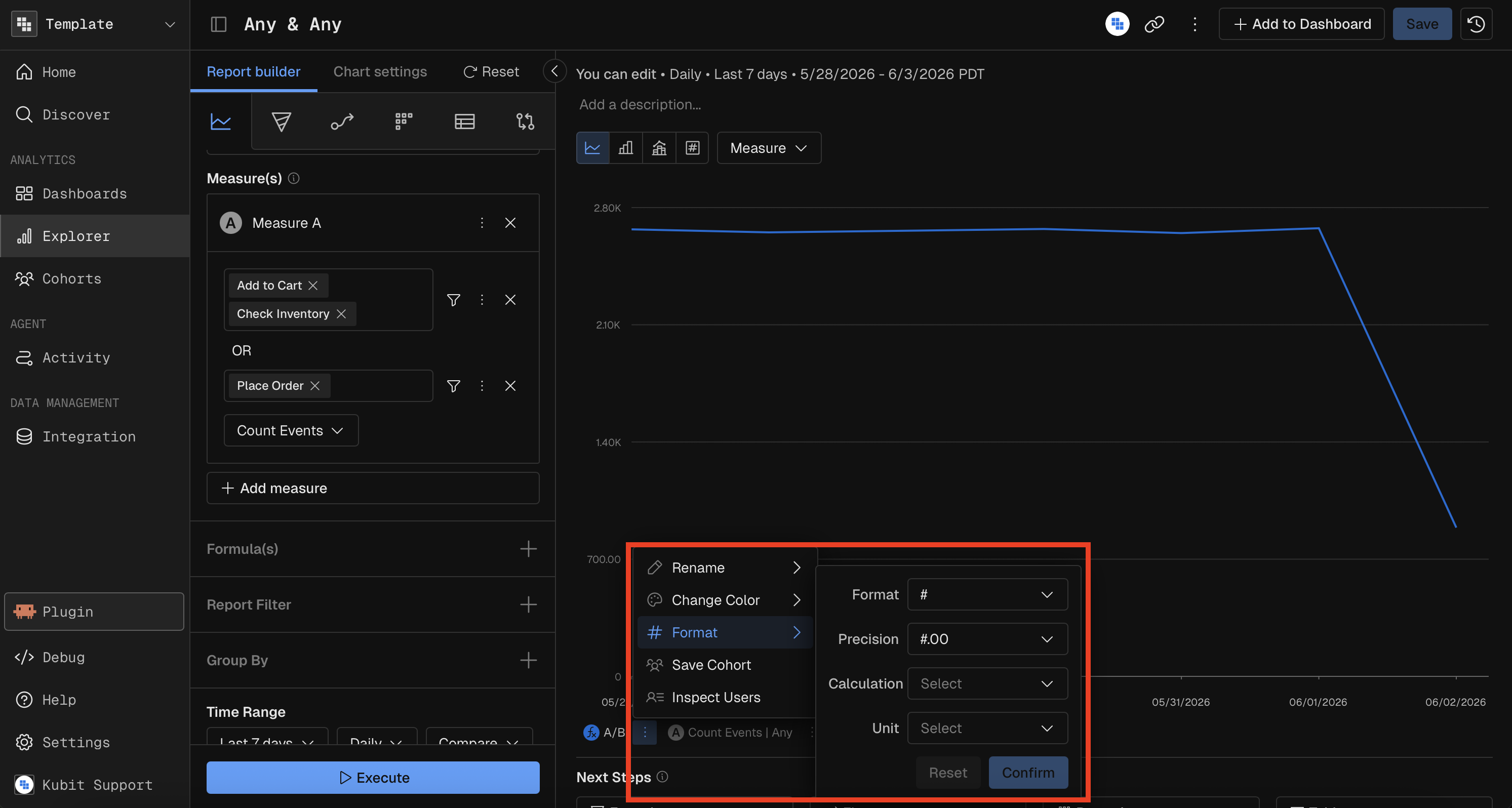
Number Formatting (Measure Display Format)
Control how measure values are displayed across the chart and table.
Setting | Options |
|---|---|
Format Kind | Number (#), Percent (%), Currency ($) |
Decimal Places | 0, 1, 2, 3, or 4 |
Calculation | Divide or Multiply by a constant before display |
Calculation Presets | 10, 60, 100, 720, 1,000, 3,600, 86,400, 1,000,000, or custom |
Unit Label | Days, Hours, Minutes, Months, Milliseconds, Seconds, Weeks, Years |
Example: To display a value stored in milliseconds as seconds with 2 decimal places, set Format Kind = Number, Calculation = Divide by 1000, Decimals = 2, Unit = Seconds.
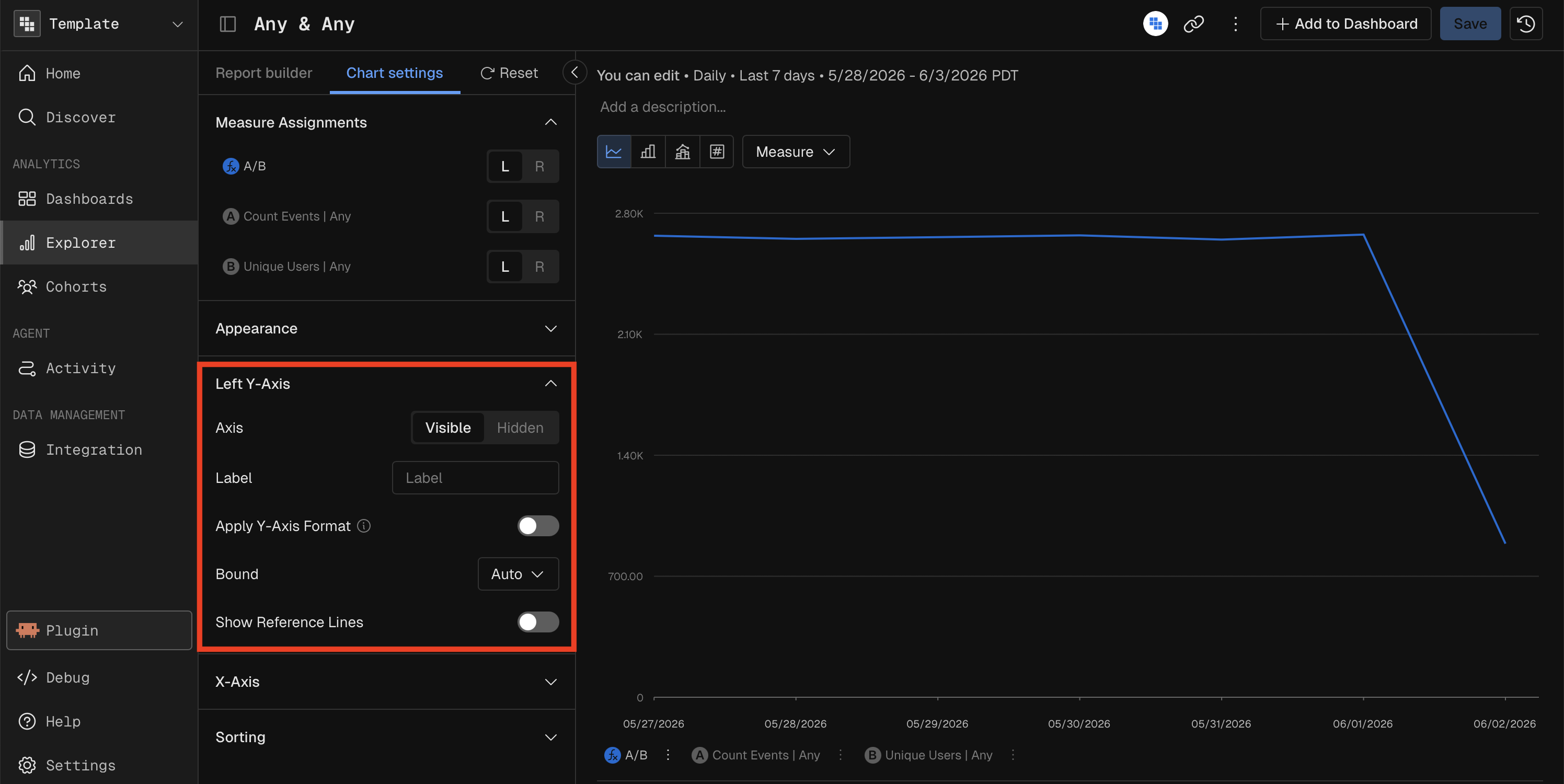
Y-Axis Configuration
Setting | Options |
|---|---|
Visibility | Show or Hide the axis |
Label | Custom text (max 50 characters) |
Format | Number, Percent, or Currency with adjustable decimals |
Bounds | Auto (default), Truncate, or Custom (set min and max values) |
Position | Left Y-Axis or Right Y-Axis (for dual-axis Combo charts) |
X-Axis Configuration
Setting | Options |
|---|---|
Visibility | Show or Hide the axis |
Label | Custom text (max 100 characters) |
Line and Point Styles (Line, Combo Charts)
Setting | Options |
|---|---|
Line Style | Straight or Smoothed (curved) |
Dot Style | Filled, Outlined, or Hidden |
Measure Line Type (Combo only) | Render each measure as a Line or as Bars |
Gridlines
Setting | Options |
|---|---|
X-Axis Gridlines | Show or Hide |
Y-Axis Gridlines | Show or Hide |
Gridline Style | Solid or Dashed |
Reference Lines
Add horizontal reference lines to mark thresholds or targets on the chart. Up to 5 reference lines per axis.
Setting | Options |
|---|---|
Value | The numeric position of the line |
Label | Text label (max 50 characters) |
Color | Custom hex color |
Stroke Style | Solid, Dashed, or Dotted |
Pie Chart Settings
Setting | Description |
|---|---|
Donut Mode | Toggle between filled pie and donut (hollow center) |
Show Labels | Display value labels on each slice |
Stacked Chart Settings
Setting | Description |
|---|---|
Number vs. Percentage | Show absolute values or normalize to 100% stacked |
Hide Others | Remove the "Others" category while maintaining total |
Rolling and Cumulative Calculations
Apply time-window calculations to smooth or accumulate values:
Calculation | Description |
|---|---|
Moving Average (7-day) | Average of the current point and the previous 6 periods |
Moving Average (30-day) | Average of the current point and the previous 29 periods |
Moving Sum (7-day) | Sum of the current point and the previous 6 periods |
Moving Sum (30-day) | Sum of the current point and the previous 29 periods |
Cumulative Sum | Running total from the start of the date range |
Sorting
Setting | Options |
|---|---|
Measure Sort | None, Alphabetical (A→Z or Z→A), Average (Low→High or High→Low) |
Breakdown Sort | Per-group sort direction for multi-dimension breakdowns |
Show Rank
When a Group By is active, toggle Show Rank to display a ranking number next to each breakdown value (1st, 2nd, 3rd…), ordered by measure value.
MCP Prompt Examples
Chart Settings are only applied in Kubit UI after a report is built, they cannot be set through MCP.
"Show me a line chart of daily revenue with a 7-day moving average, smoothed curves, and a reference line at 10,000"
"Create a 100% stacked bar chart of events by category over the last 14 days"
"Build a KPI showing average response time in seconds (the raw value is in milliseconds)"