
Chart Types
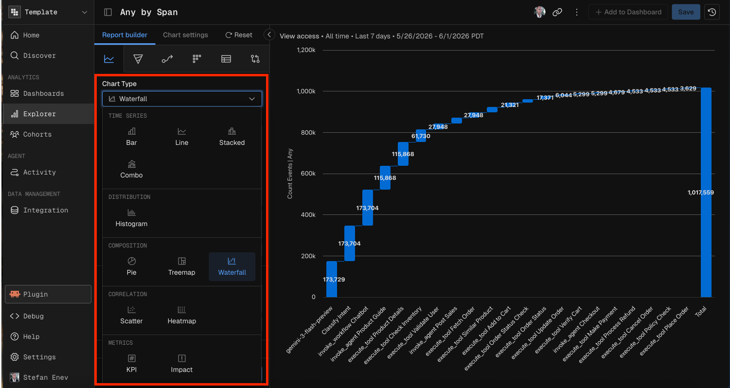
Kubit's Report Builder supports 12 chart types across five categories: Time Series, Distribution, Composition, Correlation, and Metrics. Each chart type has its own set of required and optional configuration parameters.
This guide covers what each chart type does, when to use it, and exactly what configuration it needs — both in the UI and when prompting Kubit through MCP.
Common Parameters (All Chart Types)
Every chart type requires these baseline parameters:
Parameter | Description |
|---|---|
Schema | The data schema (event table) to query against. |
Measure | At least one measure: a function (Count, Count Distinct, Sum, Avg, Min, Max, Percentile) applied to a field. Some chart types require multiple measures. |
Date Range | The time window for the query (e.g., "Last 7 days", "Last 30 days", or a custom start/end range). |
Optional parameters available to all chart types:
Parameter | Description |
|---|---|
Filter | Global filter conditions applied before aggregation. Supports operators: equals, not equals, contains, starts with, ends with, greater than, less than, between, exists, is empty, and regex matches. Conditions combine with AND/OR logic. |
Cohort | Restrict results to a predefined user cohort. |
Sample % | Sampling rate for large datasets. |
Time Series Charts
Time series charts plot data over time. They support granular time units (Hour, Day, Week, Month, Quarter, Year) in addition to All Time.
Bar
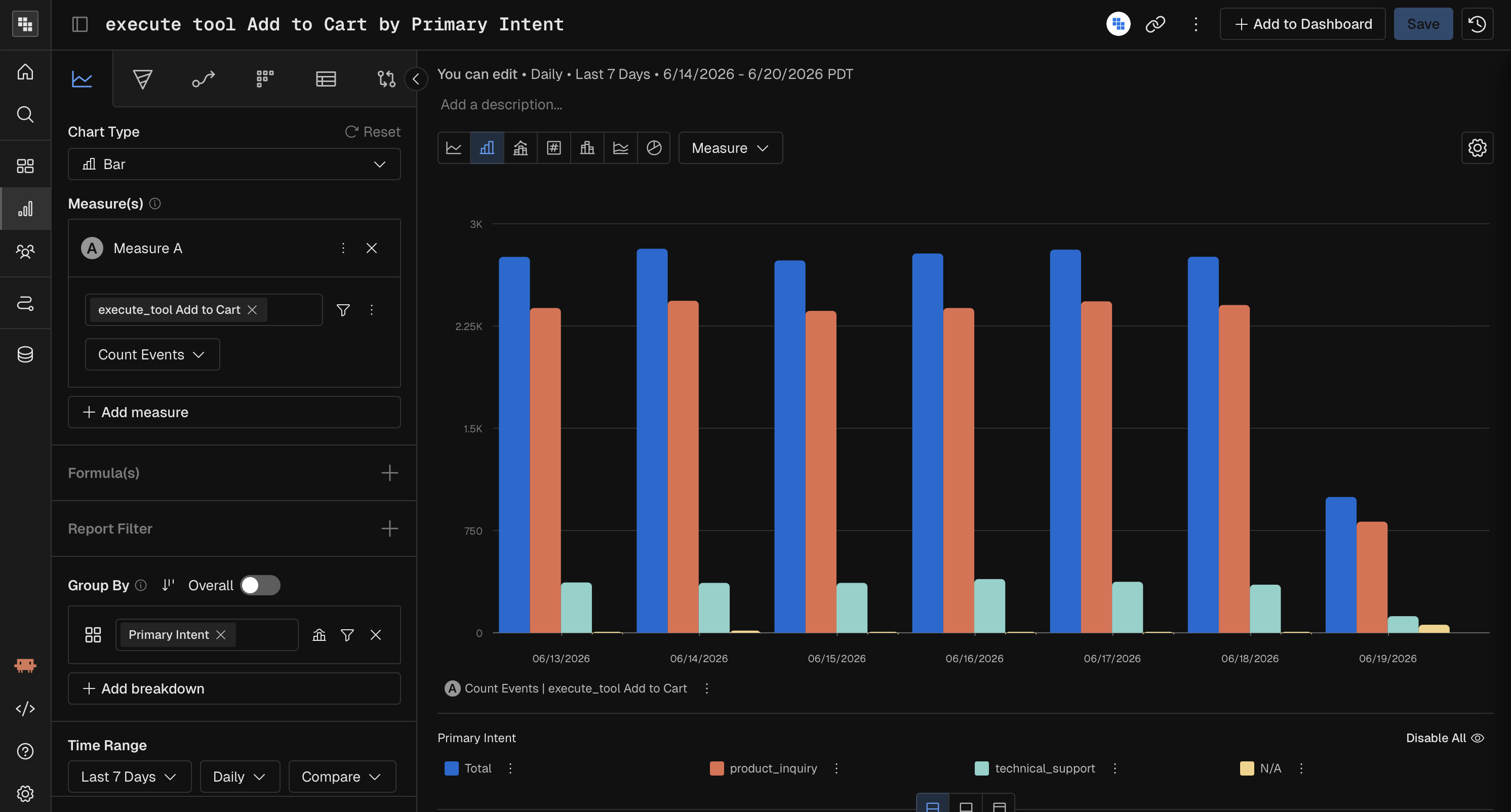
A vertical bar chart showing values over time periods. Best for comparing discrete time buckets.
Parameter | Required? | Notes |
|---|---|---|
Measure | Yes | One or more measures. |
Time Unit | Yes | Hour, Day, Week, Month, Quarter, Year, or All Time. |
Breakdown | No | Split bars by a dimension (e.g., by country, by plan). |
Comparison | No | Compare against a prior period (e.g., previous 7 days). |
Line
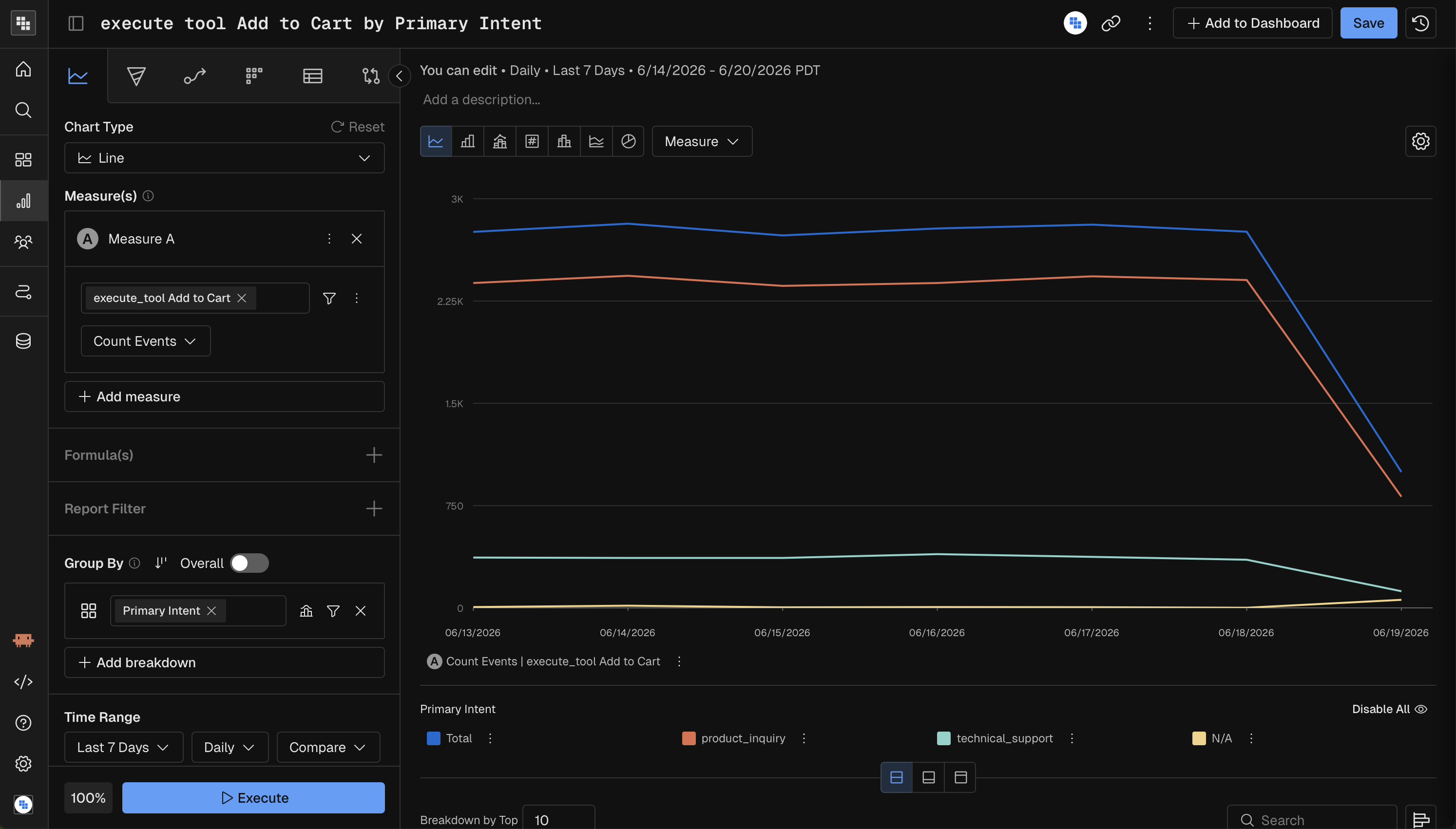
A line chart connecting data points over time. Best for spotting trends and patterns across continuous time periods.
Parameter | Required? | Notes |
|---|---|---|
Measure | Yes | One or more measures. |
Time Unit | Yes | Hour, Day, Week, Month, Quarter, Year, or All Time. |
Breakdown | No | Add lines per dimension value. |
Comparison | No | Overlay a prior period for comparison. |
Stacked
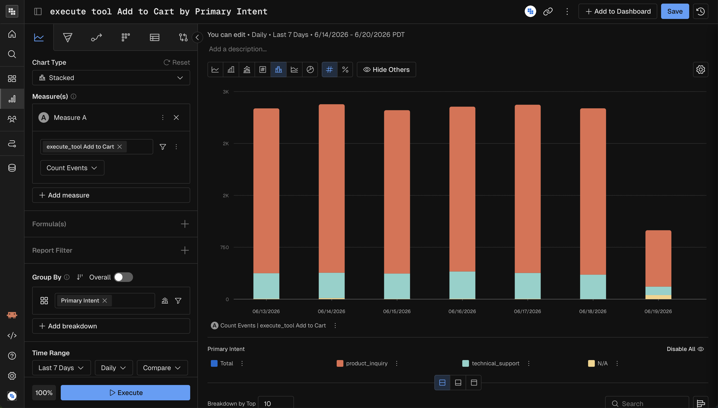
A stacked column chart where each bar is divided into segments by a breakdown dimension. Best for showing part-to-whole relationships over time.
Parameter | Required? | Notes |
|---|---|---|
Measure | Yes | One or more measures. |
Time Unit | Yes | Hour, Day, Week, Month, Quarter, Year, or All Time. |
Breakdown | Yes | At least one breakdown group is mandatory. Each segment represents a dimension value. |
Comparison | No | Compare against a prior period. |
Combo
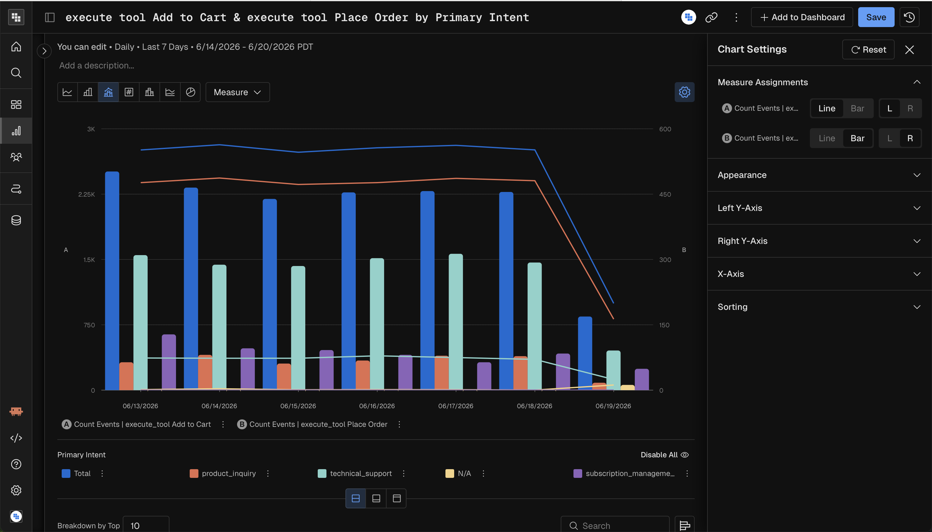
A combination chart that overlays bars and lines on the same time axis. Best for comparing two measures with different scales (e.g., revenue as bars, conversion rate as a line).
Parameter | Required? | Notes |
|---|---|---|
Measure | Yes | Two or more measures recommended (one renders as bars, another as a line). |
Time Unit | Yes | Hour, Day, Week, Month, Quarter, Year, or All Time. |
Breakdown | No | Split by dimension. |
Comparison | No | Compare against a prior period. |
Distribution Charts
Histogram
A histogram showing the distribution of a measure's values across buckets. Best for understanding how values are spread (e.g., "How are session durations distributed?").
Parameter | Required? | Notes |
|---|---|---|
Measure | Yes | One measure. If multiple measures are used, a formula combining them is required. |
Time Unit | All Time only | Histograms aggregate across the entire date range; time-unit granularity is not supported. |
Binning | Yes | Configure how values are bucketed: auto-range (min, max, bin count), manual ranges, or enum buckets. |
Breakdown | No | Limited to 1 breakdown group maximum. |
Comparison | No | Not supported. |
Formula | Conditional | Required when using multiple measures (compound measure). |
Steps to build your Histogram Analysis
Change the Mode in Query to Histogram.
Select the Metric you want to measure that is going to be impacted. Typically these are Sum, Count Event, or a Compound Measure , showing % per User.
Select the Subject you want to analyze, this will be the "thing we are counting" that would perform the measure you create in Step 2.
Choose your 'Count Subject' by in the y-axis
Choose your 'Group By' in the x-axis (Binning)
You are able to use a pre-built Range if it's applicable or create a custom one.
These Bins will be related to the expected values from your Measure in Step 2.
Ex. If you are counting events performed and a user typically only can do that action 10 times in a day then the max number of your Range would likely be 10.
Apply any necessary filters
You cannot perform Breakdowns in Histogram Mode
Select the date range
Execute!
Composition Charts
Pie
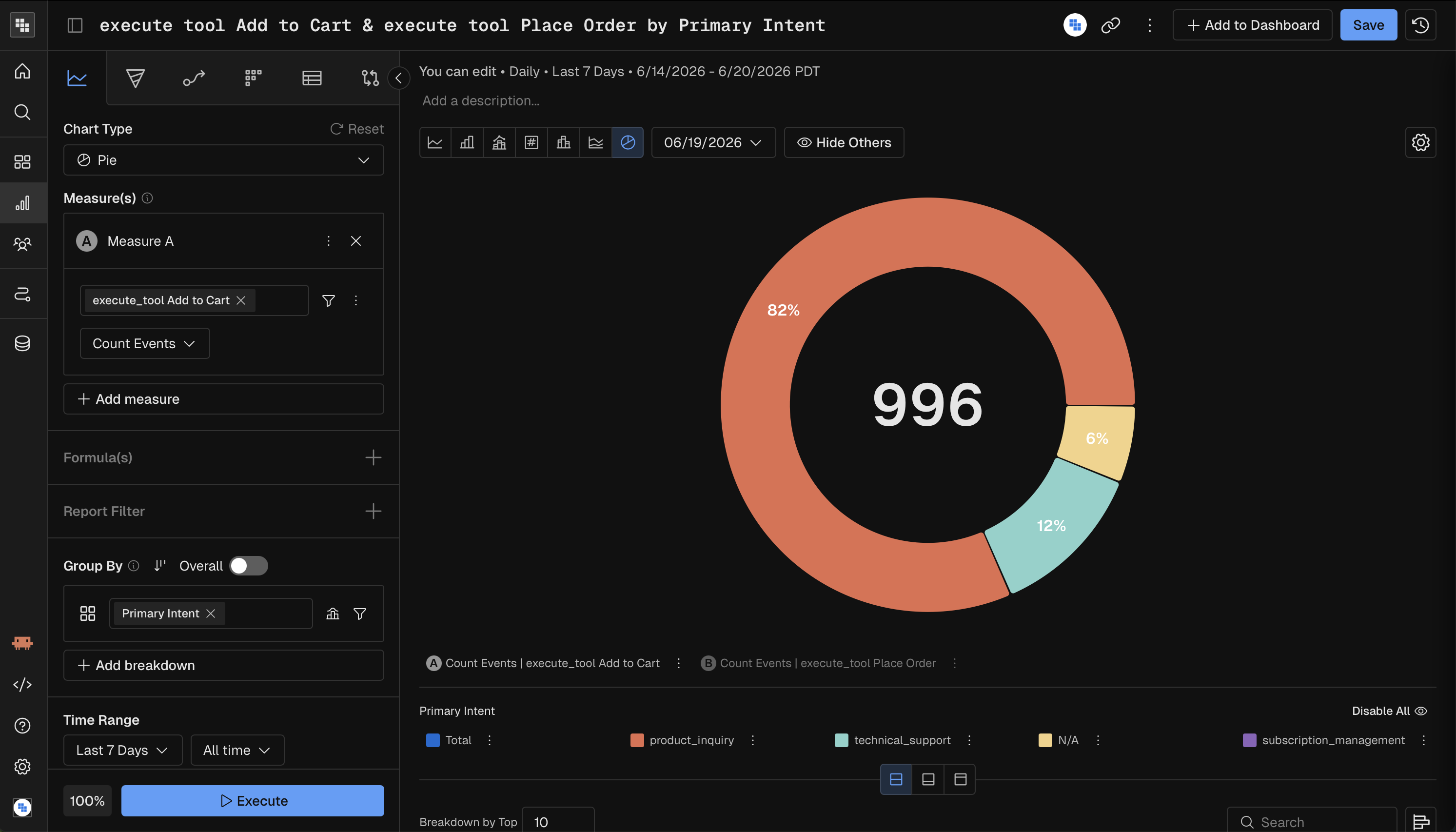
A pie chart showing proportional breakdown of a single measure. Best for quick part-to-whole snapshots when there are few categories.
Parameter | Required? | Notes |
|---|---|---|
Measure | Yes | One or more measures. |
Time Unit | All Time only | Pie charts aggregate across the full date range. |
Breakdown | Yes | At least one breakdown group is mandatory. Each slice represents a dimension value. |
Comparison | No | Compare against a prior period. |
Treemap
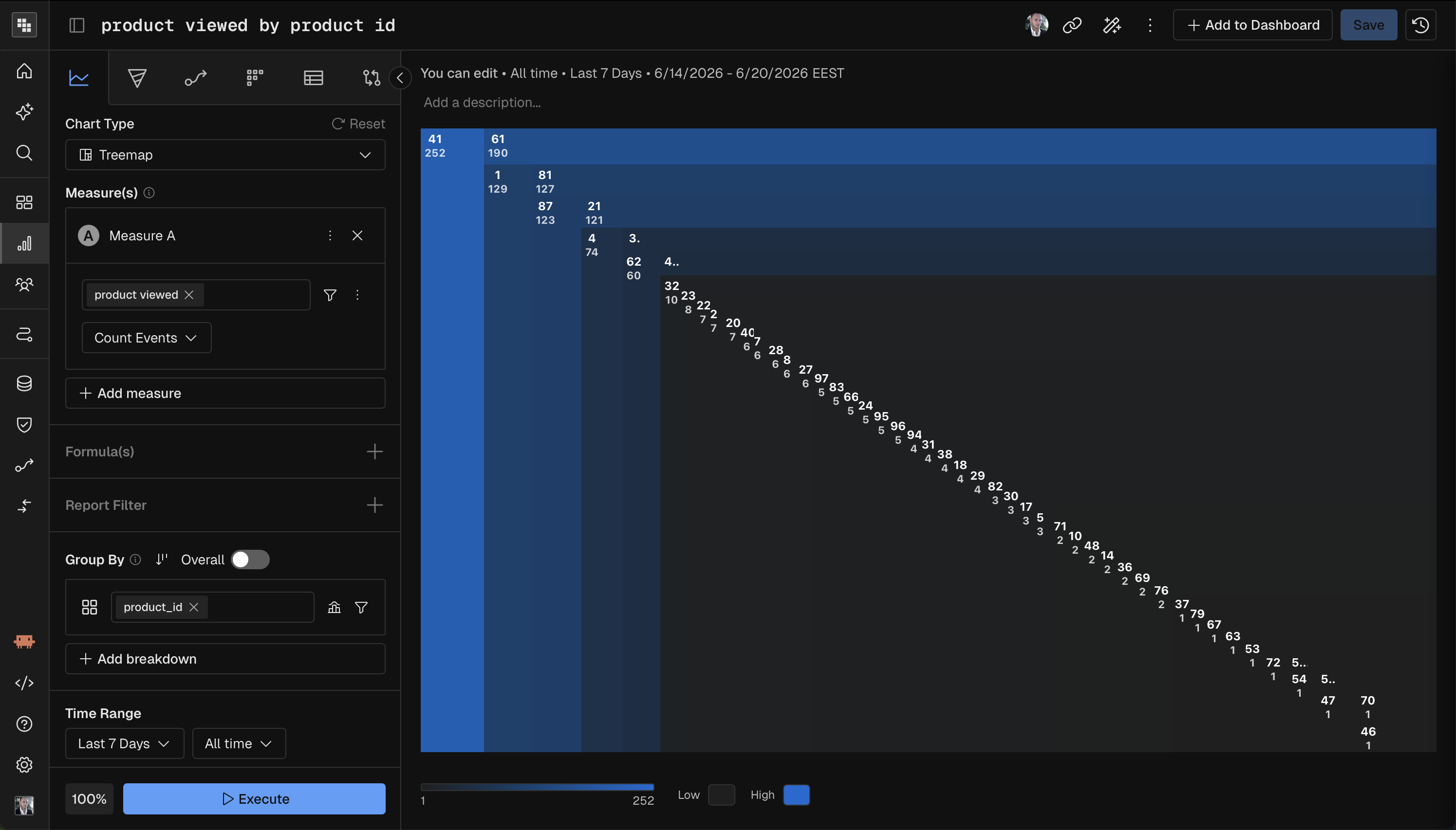
A treemap showing hierarchical proportional data as nested rectangles. Best for visualizing relative sizes across many categories, especially with hierarchical breakdowns.
Parameter | Required? | Notes |
|---|---|---|
Measure | Yes | One measure. If multiple measures are used, a formula is required. |
Time Unit | All Time only | Treemaps aggregate across the full date range. |
Breakdown | Yes | At least one breakdown group is mandatory. |
Comparison | No | Not supported. |
Formula | Conditional | Required when using multiple measures. |
Waterfall
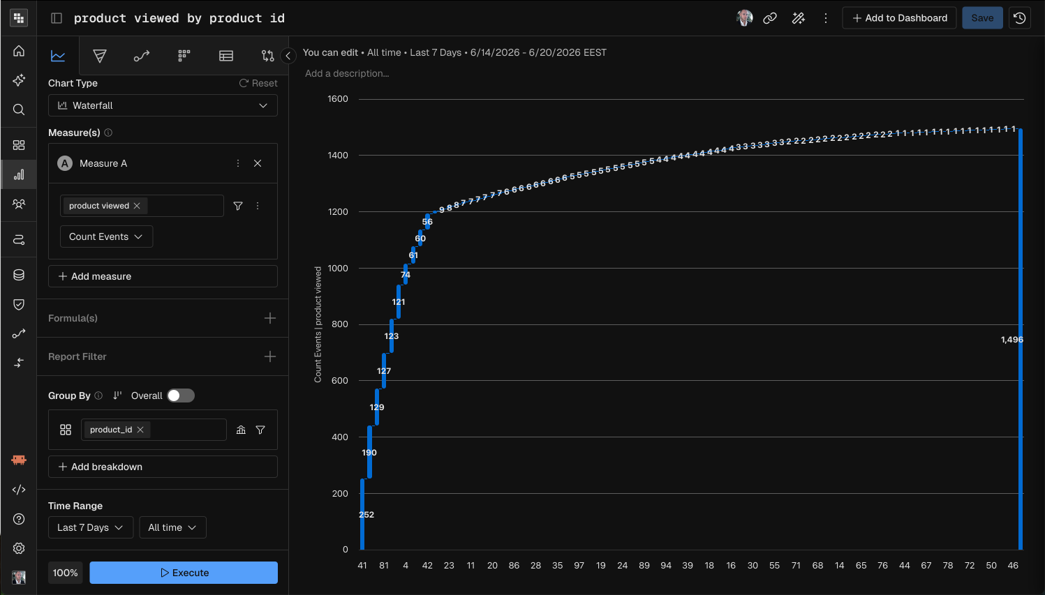
A waterfall chart showing how individual components add up to a total. Best for understanding incremental contributions (e.g., which event types contribute most to total count).
Parameter | Required? | Notes |
|---|---|---|
Measure | Yes | One measure. If multiple measures are used, a formula is required. |
Time Unit | All Time only | Waterfall charts aggregate across the full date range. |
Breakdown | Yes | At least one breakdown group is mandatory. Each bar represents a dimension value's contribution. |
Comparison | No | Not supported. |
Formula | Conditional | Required when using multiple measures. |
Correlation Charts
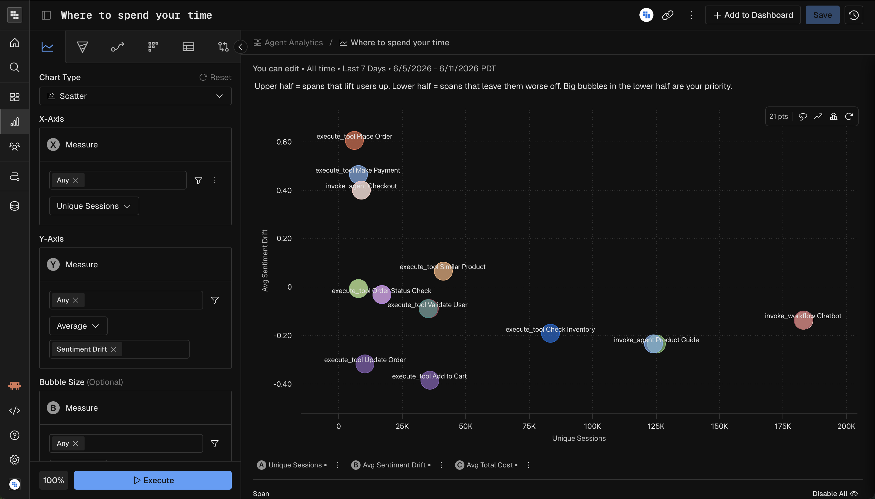
Scatter
A scatter plot mapping three measures to X-axis, Y-axis, and bubble size. Best for spotting correlations between two metrics, with a third metric as context.
Parameter | Required? | Notes |
|---|---|---|
Measure | Yes — 2 required | X-axis measure, Y-axis measure, and Bubble Size measure. All three must be configured. |
Time Unit | All Time only | Scatter plots aggregate across the full date range. |
Breakdown | Yes — exactly 1 group | Optional — adds labels/colors per dimension value. |
Comparison | No | Not supported. |
Formula | Conditional | Required when using multiple measures as compound inputs. |
Heatmap
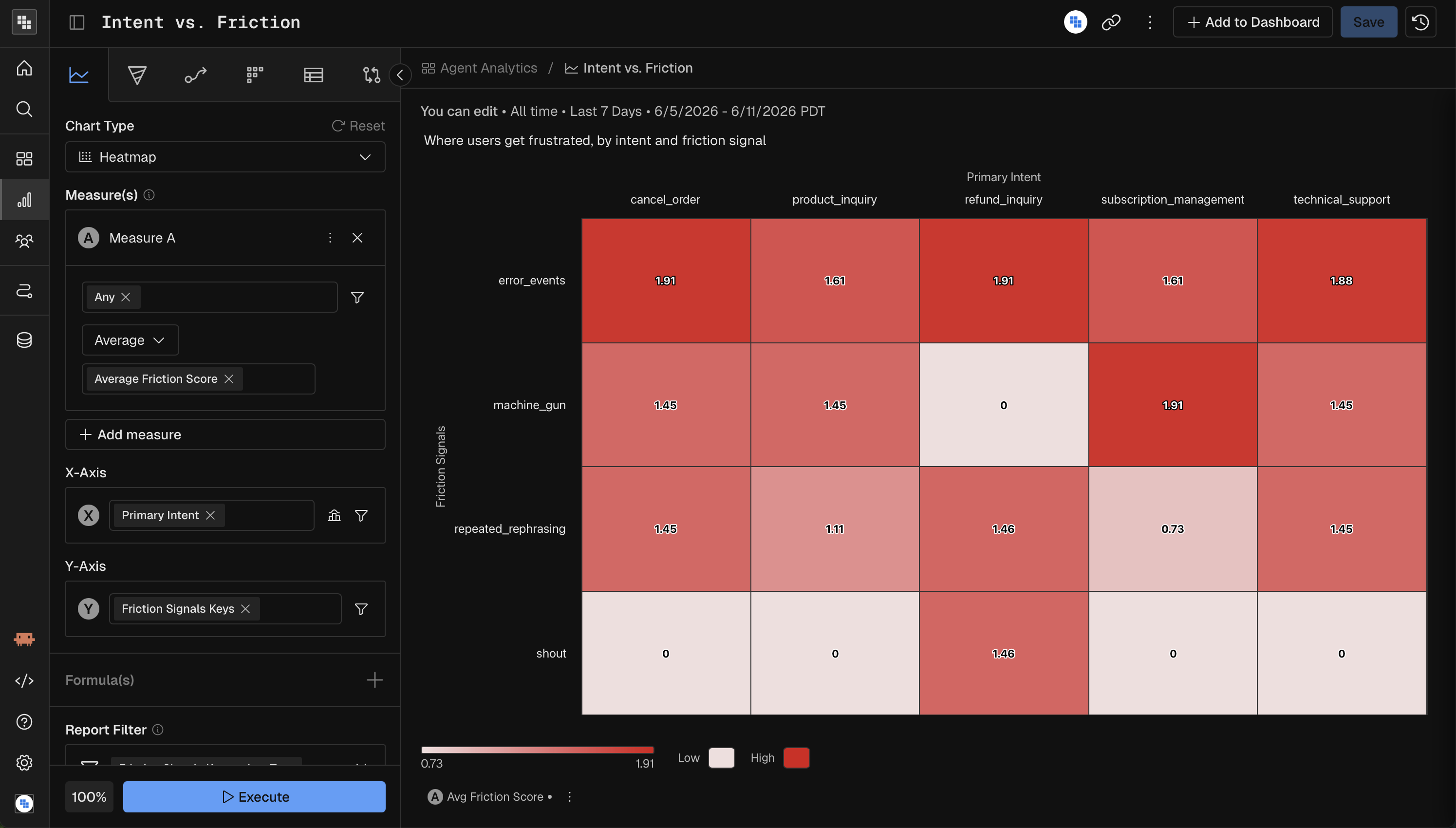
A heatmap plotting two dimensions on X and Y axes with color intensity representing measure values. Best for finding patterns across two categorical dimensions (e.g., activity by day-of-week and hour).
Parameter | Required? | Notes |
|---|---|---|
Measure | Yes | One measure. If multiple measures are used, a formula is required. |
Time Unit | All Time only | Heatmaps aggregate across the full date range. |
Breakdown | Yes — exactly 2 groups | First group maps to the X-axis, second to the Y-axis. Both must have a field configured. |
Comparison | No | Not supported. |
Formula | Conditional | Required when using multiple measures. |
Metric Charts
KPI
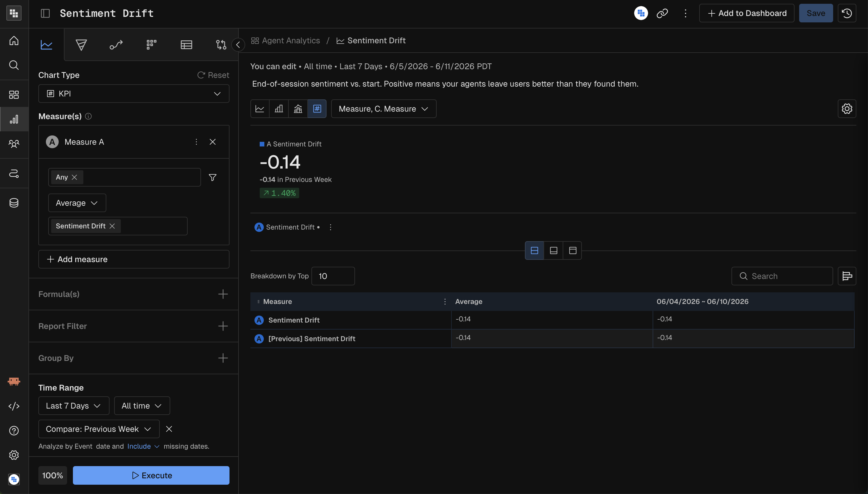
A single large number (or set of numbers) showing a key metric with optional trend. Best for dashboards and at-a-glance performance indicators.
Parameter | Required? | Notes |
|---|---|---|
Measure | Yes | One or more measures. Each renders as its own KPI card. |
Time Unit | Yes | Hour, Day, Week, Month, Quarter, Year, or All Time. |
Breakdown | No | Optional grouping. |
Comparison | No | Show change vs. prior period (e.g., "+12% vs. last week"). |
Impact
An impact chart measuring how a specific trigger event affects a metric over time. Best for evaluating the effect of product changes, feature launches, or campaigns.
Parameter | Required? | Notes |
|---|---|---|
Measure | Yes | The metric to evaluate impact on. |
Trigger Event | Yes | The event condition that defines the "trigger" — the moment whose impact you want to measure. |
Time Unit | Yes | Hour, Day, Week, Month, Quarter, Year, or All Time. |
Breakdown | No | Optional dimension to compare impact across segments. |
Comparison | No | Not supported. |
Within Impact Analysis the main use case is: "What is the impact to Metric A after a user engages with Event A?" More practically, here are a few examples from your favorite digital products:
What is the impact to Total Time Watched after a user is shown a Content Recommendation?
What is the impact of Total Sessions after a user signs up?
What is the impact of Customer lifetime value (LTV) after they purchase their first premium item?
Steps to build your Impact Analysis
Change the Chart Type in Query to Impact Analysis.
Choose the Metric you want to measure that is going to be impacted. Typically these are Sum, Count Event, or a Compound Measure, showing percent per User.
Apply any necessary filters or breakdowns.
Define the date range.
Select the Event that is the Impact or "trigger" event. This will be the thing that you believe will Impact your metric you built in Step 1.
Examples include Campaign Impression, Content Recommended, Signed In, etc.
Execute the analysis!
Interpreting Results of Impact Analysis
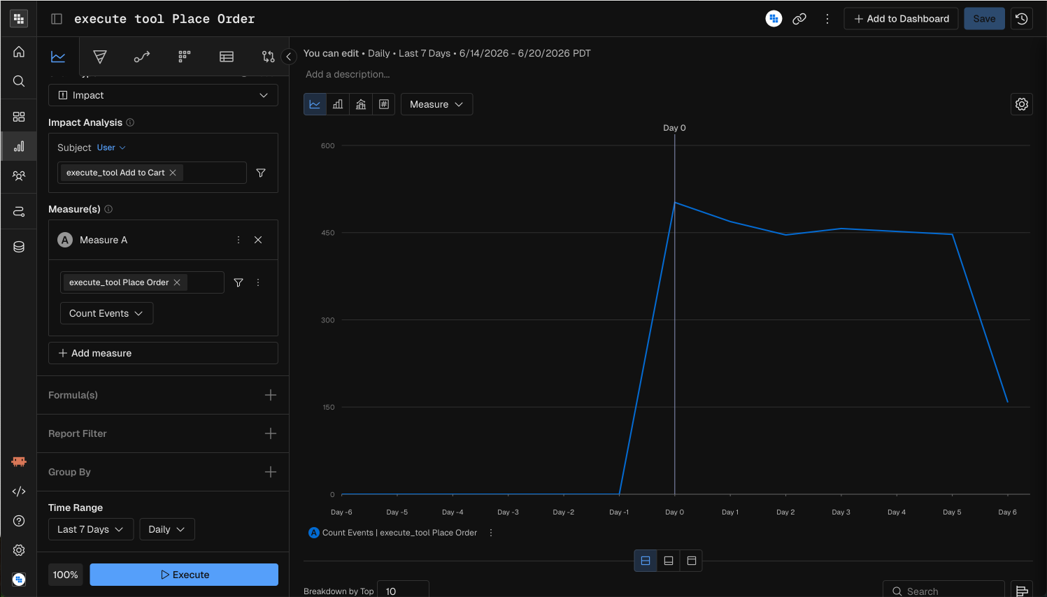
When you see the results what you see is the following:
A Day 0 indicator in the center of the chart showing that is was the first time in the period you selected that these users triggered the "Add to Cart" tool execution.
A negative and positive Day counter on either side.
This shows the days less than or after the Day 0 event date. It could be different for each user as you're selecting a date range so we normalize them for you.
A line indicating the Metric (or Measure) you defined in Step 1.
This will show IF the metric was impacted by the event you selected.
What we can see in our example is that in general "Add to Cart" had a positive impact on Order placement for our users during that time period.
Quick Reference: Chart Type Capabilities
Chart Type | Time Granularity | Breakdown | Comparison | Date Kind | Special Requirements |
|---|---|---|---|---|---|
Bar | Any | Optional | Yes | Yes | — |
Line | Any | Optional | Yes | Yes | — |
Stacked | Any | Required (1+) | Yes | Yes | — |
Combo | Any | Optional | Yes | Yes | — |
Histogram | All Time only | Optional (max 1) | No | Yes | Binning required |
Pie | All Time only | Required (1+) | Yes | Yes | — |
Treemap | All Time only | Required (1+) | No | No | Formula for compound measures |
Waterfall | All Time only | Required (1+) | No | No | Formula for compound measures |
Scatter | All Time only | Optional | No | No | 3 measures (X, Y, Size) |
Heatmap | All Time only | Required (exactly 2) | No | No | Formula for compound measures |
KPI | Any | Optional | Yes | Yes | — |
Impact | Any | Optional | No | Yes | Trigger event required |