Query Overview
Use Cases
Query focuses on "how many" type questions. Here's a few sample scenarios:
Determine how many users performed an event on my product over the last 7 days.
Calculate the percentage of paying users who performed our critical event last month.
Track and understand what our monthly active user count is for the past 6 months.
Find many users do we have on average over the past 7 days performing any event.
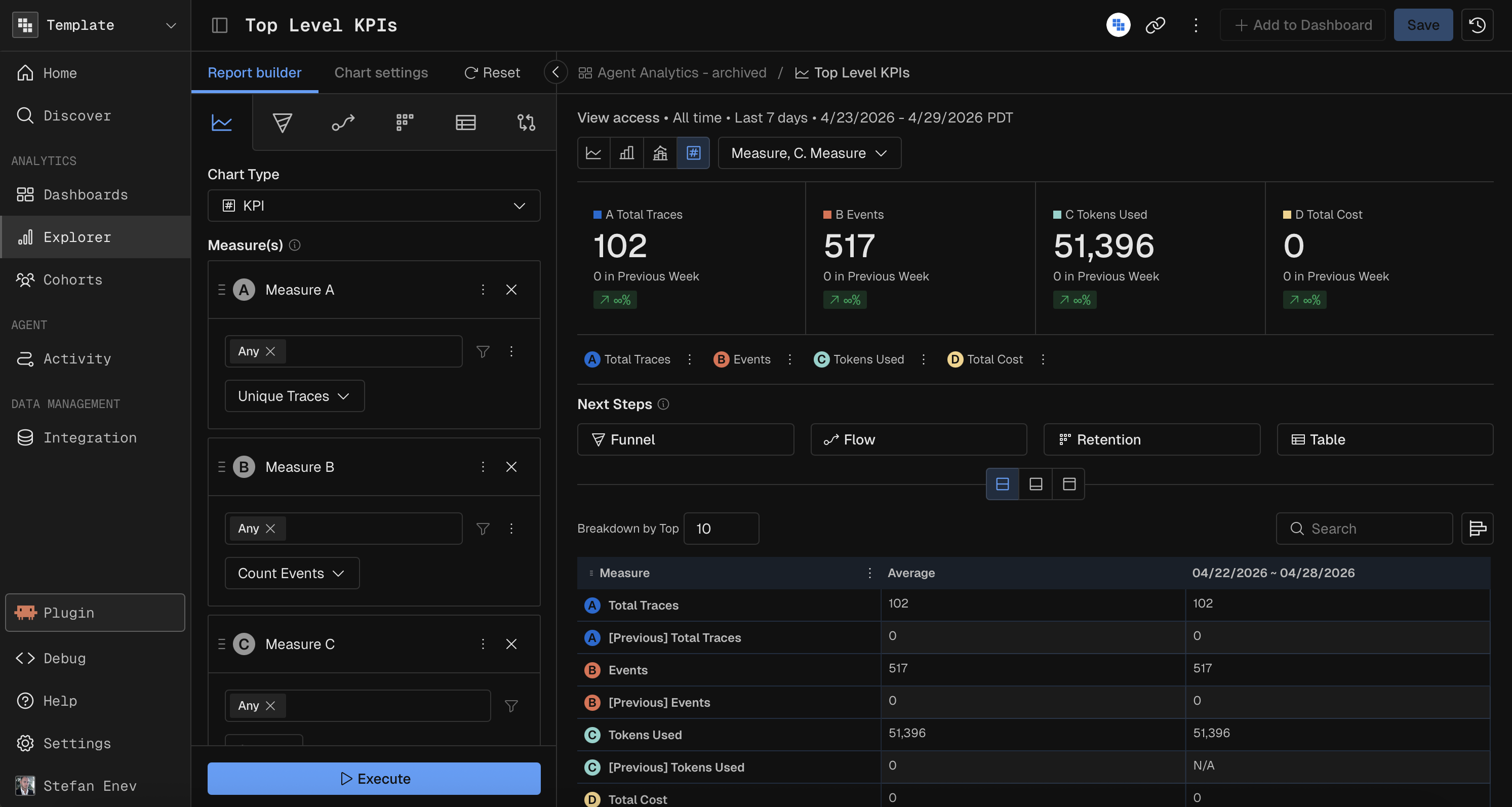
Building Your Measures
A measure consists of three components: the event to analyze, the function to compute, and any filters to apply.
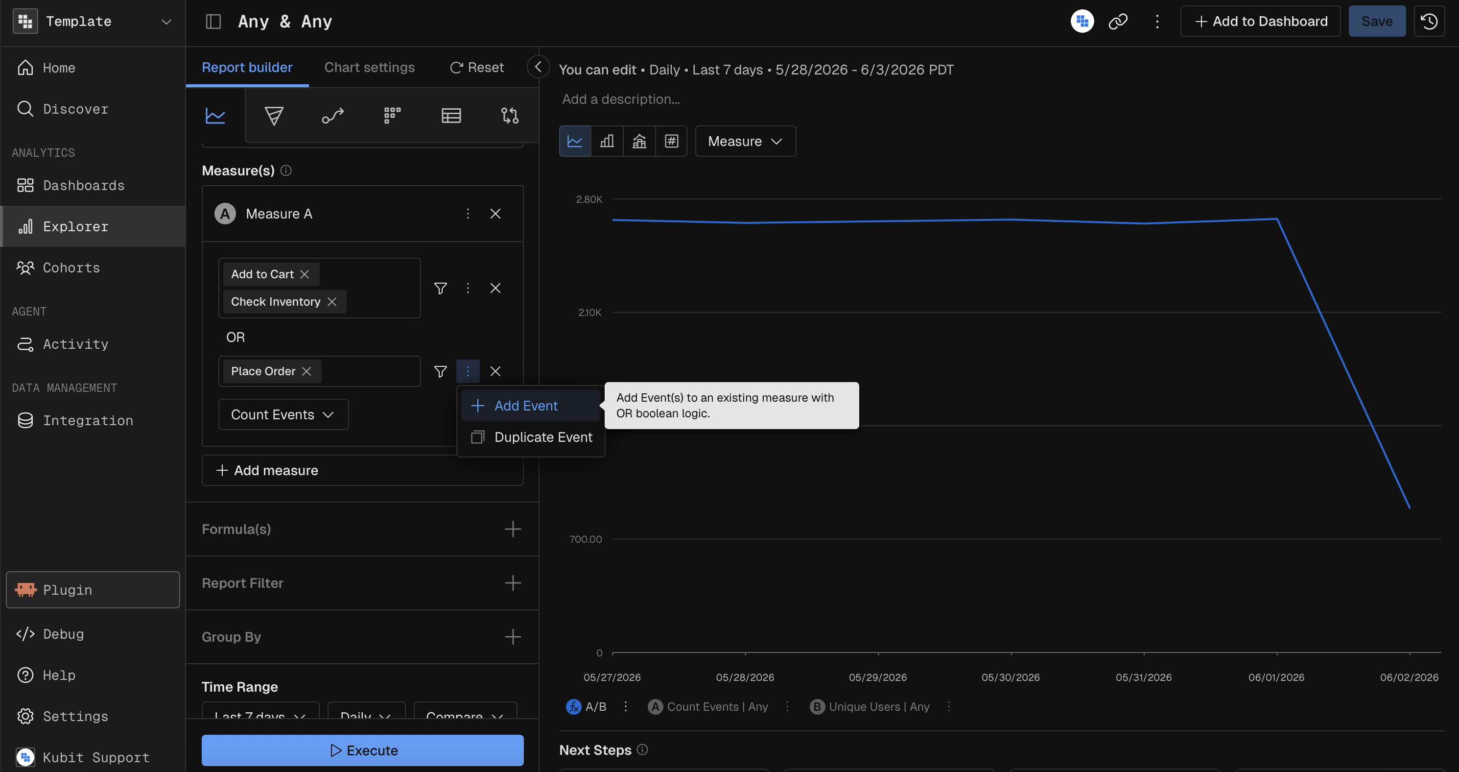
Event
Select the event(s) you want to analyze inside of your chart by selecting them through the dropdown. You can select multiple events to perform an OR logic, which means all members of the measure had to perform Event 1 or Event 2. You can also add multiple event groups in case you need to apply different filters on them as shown below:
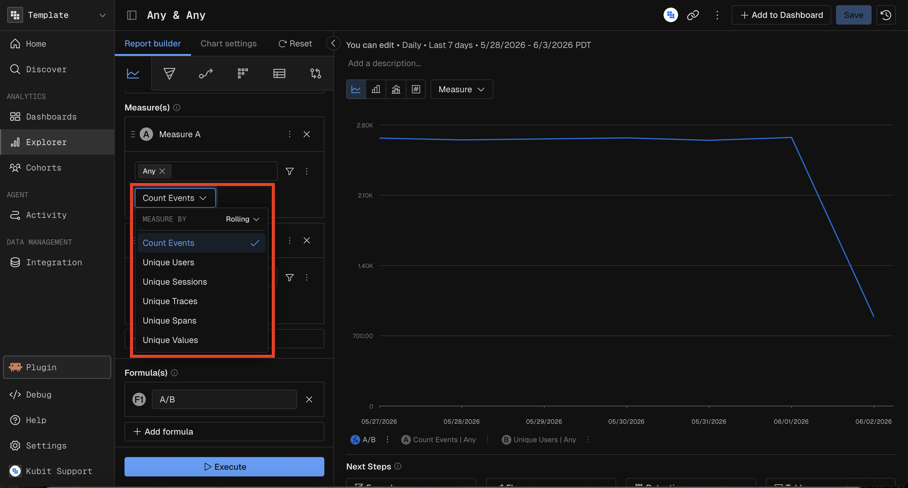
Measure Functions
Function | Description | Field Required? |
|---|---|---|
Count | Count of all events | No |
Count Distinct | Count of unique values of a field | Yes |
Sum | Sum of a numeric field's values | Yes |
Avg | Average of a numeric field's values | Yes |
Min | Minimum value of a field | Yes |
Max | Maximum value of a field | Yes |
Percentile | Nth percentile of a field's values | Yes (+ percentile value, e.g., P95) |
Prompting Kubit Through MCP
When using Kubit through MCP (e.g., from Claude, ChatGPT, or other AI tools), you create reports by describing what you want in natural language. The MCP server translates your request into the appropriate chart configuration.
Effective Prompts
A good prompt specifies:
Chart type — what visualization you want
Measure — what to calculate (count, sum, average, etc.) and on which field
Date range — the time window
Breakdown (if needed) — how to segment the data
Filters (if needed) — conditions to narrow the data
Examples by Complexity
Simple — single measure, no breakdown:
"Show me a KPI of total events this week"
Medium — measure + breakdown + time range:
"Create a bar chart of daily count distinct users over the last 14 days, broken down by country"
Advanced — multiple measures, filters, comparison:
"Build a combo chart showing weekly total revenue as bars and average order value as a line for the last 3 months, filtered to premium users, compared to the previous 3 months"
Specialized — chart-specific parameters:
"Create a heatmap of average response time with model name on the X-axis and tool name on the Y-axis for the last 7 days"
Tips
You don't need to specify the schema — Kubit infers it from your workspace context.
If you're unsure which chart type to use, describe what you want to learn and Kubit will choose an appropriate visualization.
For Impact charts, clearly describe the trigger event (e.g., "after users click checkout" or "when the deploy event fires").
Breakdowns are automatically added when you say "by [dimension]" (e.g., "by country", "by browser").
Filters are inferred from phrases like "only premium users", "where status is error", or "excluding test accounts".
Chart Types
See Chart Types for a detailed list.
Filter Reference
Check out the Filters article.
Formula
More details in the Formula reference.
Group By and Binning
See Group By and Binning.
Compare
Go to Compare for more details.
Chart Settings and Formatting
Here's the reference on Query Chart Settings and Formatting.
Data Table and Visibility Controls
Find more on how to navigate and adjust the data table below the chart here.