Data Table
This guide covers the configuration features of Kubit's Data Table report: Measures, Group By, Formulas, Compare, Time Granularity, and table display options.
When to Use a Data Table
A Data Table report is the right tool when you need to explore raw aggregated data in tabular form with more dimensional depth than a chart-based Query report allows.
Use Case | Example |
|---|---|
Multi-dimensional breakdown | Break down latency by model, environment, span type, trace name, and error code — all in one table (up to 5 dimensions). |
Data export | Pull a structured dataset for offline analysis or sharing with stakeholders. |
Detailed comparison | Compare this week's metrics to last week's in a column-by-column tabular layout with percent change. |
Anomaly spotting | Scan a heatmap-colored table to quickly identify outlier cells across many dimension combinations. |
Ad-hoc exploration | Quickly pivot across dimensions without committing to a specific chart type. |
Data Table vs. Query report with table view:
Data Table supports up to 5 Group By dimensions (vs. 2 in Query reports).
Data Table supports up to 6 measures per report.
Data Table is purpose-built for tabular exploration — it has column filtering, inline bar charts, and heatmap coloring that the Query table view does not.
Data Table does not support Formula
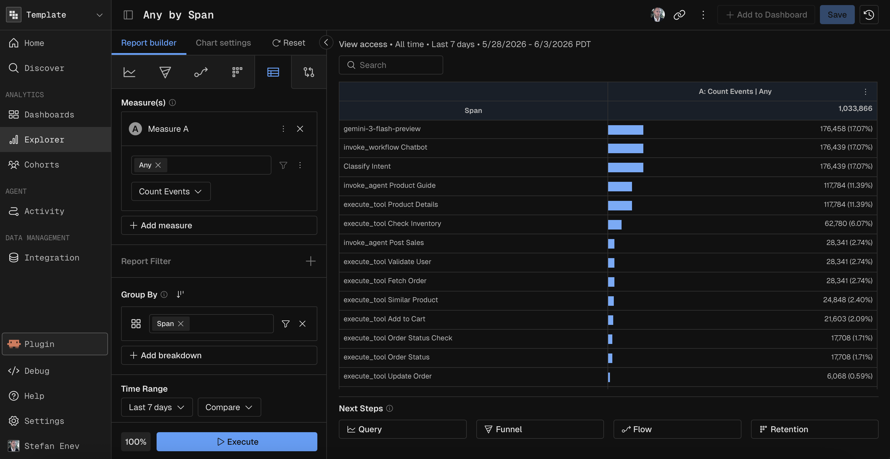
Measures
Configure one or more measures to aggregate in the table. Each measure is a function applied to a field.
Constraint | Value |
|---|---|
Max measures | 6 |
See the Measure Functions reference for the full list of available functions (Count, Count Distinct, Sum, Avg, Min, Max, Percentile).
Group By
Group By defines the dimensions that form the table's rows. Each unique combination of dimension values becomes a row.
Constraint | Value |
|---|---|
Max breakdown groups | 5 |
Max cohort segments | 5 |
This is significantly more than the 2-group limit in Query reports, making Data Table the best choice for multi-dimensional exploration.
Each Group By field supports optional binning (Range, Enum, Date, Named) and per-field filters. See the Binning reference for details.
Compare
Data Table supports period-over-period comparison. Select a comparison period and each measure column splits into current and previous values displayed side by side.
Comparison Presets
Preset | Offset |
|---|---|
Previous Day | 1 day back |
Previous Week | 1 week back |
Previous Month | 1 month back |
Previous Quarter | 1 quarter back |
Previous Year | 1 year back |
A custom date option is also available.
Percent Change
When comparison is active, toggle Show % Change to add a percent delta column showing the relative change between periods. Positive changes are highlighted in green, negative in red.
Time Granularity
Data Table supports all time granularities — it is not limited to All Time.
Time Unit | Description |
|---|---|
Hour | Hourly aggregation |
Day | Daily aggregation |
Week | Weekly aggregation |
Month | Monthly aggregation |
Quarter | Quarterly aggregation |
Year | Yearly aggregation |
All Time | Aggregate across the full date range |
Table Display Features
Column Sorting
Click any column header to sort the table by that column. Supports both alphabetical and numerical sorting in ascending or descending order.
Inline Visualizations
Feature | Description |
|---|---|
Horizontal bars | Toggle to show relative-width bars within measure cells, giving a visual sense of magnitude across rows. |
Heatmap coloring | Color cells by value intensity across a gradient — high values in one color, low in another. |
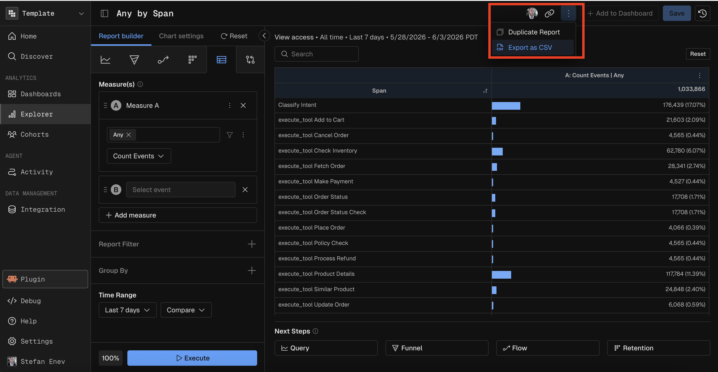
Export
Export the table data as a CSV file from the options menu (three-dot icon).
Prompting Kubit Through MCP
When using Kubit through MCP, you create Data Table reports by describing the measures and dimensions you want to explore. The MCP server translates your request into the appropriate table configuration.
Effective Prompts
A good Data Table prompt specifies:
Measures — what to calculate (count, average, sum, etc.)
Group By dimensions — the fields to break down by (up to 5)
Date range — the time window
Time granularity (if not All Time) — how to slice the time axis
Comparison (if needed) — a prior period to compare against
Filters (if needed) — conditions to narrow the data
Examples by Complexity
Simple — one measure, one dimension:
"Create a data table of event count by model name over the last 7 days"
Medium — multiple dimensions with time granularity:
"Build a data table of daily average latency and total cost by model name and environment for the last 30 days"
Advanced — formula + comparison + many dimensions:
"Create a data table with error count divided by total count (A/B) by model, environment, and trace name, this week compared to last week with percent change"
Specialized — multi-dimensional exploration:
"Show me a data table of count distinct users, average latency, and P95 latency grouped by model, span type, trace name, environment, and status code over the last quarter"
Tips
Data Table supports up to 5 Group By dimensions — use it when you need more breakdown depth than a chart allows (Query charts max out at 2).
Say "compared to last week" or "compared to previous month" to add period-over-period comparison with automatic percent change.
Data Table supports all time granularities — say "daily", "weekly", "monthly", etc. to control the time axis.