Data Table and Visibility Controls
Every Query report has both a chart view and a data table view. The table shows the same data in row-and-column format with sorting, filtering, and export capabilities.
View Modes
Three layout options are available (in the report builder):
Mode | Description |
|---|---|
Chart + Table | Both chart and table displayed together (default in build mode) |
Chart Only | Only the chart is visible |
Table Only | Only the data table is visible |
Toggle between modes using the view icons in the report builder toolbar.
Data Table Features
Sorting
Click a column header to sort by that column. Supports alphabetical and numerical sort in ascending or descending order.
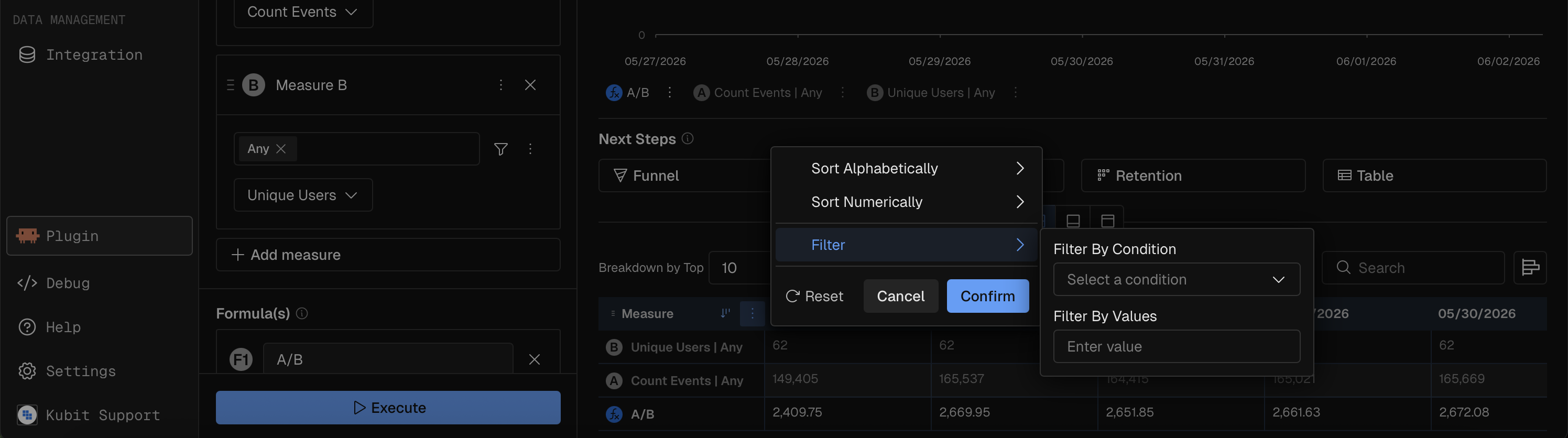
Column Filtering
Each column has a filter menu with these operators:
Operator | Description |
|---|---|
Equals | Exact match |
Does not equal | Exclude exact match |
Begins with | Prefix match |
Does not begin with | Exclude prefix |
Ends with | Suffix match |
Does not end with | Exclude suffix |
Contains | Substring match |
Does not contain | Exclude substring |
Column Resizing
Drag column borders to adjust width (minimum 160px). Widths are saved with the report.
Horizontal Bars
Toggle to display inline bar charts within table cells, showing relative magnitude at a glance.
Percent Delta
Toggle to show percentage change values alongside absolute numbers.
Hiding and Showing Data
You can control which parts of a report are visible without changing the underlying query. These controls appear in the legend area below the chart.
Hide/Show Measures
Click a measure chip in the legend to toggle that measure's visibility. Hidden measures are grayed out. This affects both the chart and the data table.
On Scatter and Heatmap charts, measure visibility is not toggleable because measures are positionally bound (X-axis, Y-axis, bubble size).
Hide/Show Breakdown Values (Series)
Click a group value chip in the legend to toggle that series on or off. For example, in a chart broken down by country, click "US" to hide/show the US series.
A maximum number of visible series is enforced to keep charts readable. If you try to enable more than the limit, a warning toast appears.
Use the Enable All / Disable All button (eye icon) to toggle all series at once.
Hide Others
The Hide Others button removes the "Others" catch-all category from the chart and table. This is useful when you only want to see the explicitly named breakdown values without the aggregated remainder. Also, when you hide the "Others" group on stacked charts the percentages will be recalculated based only on the visible groups.
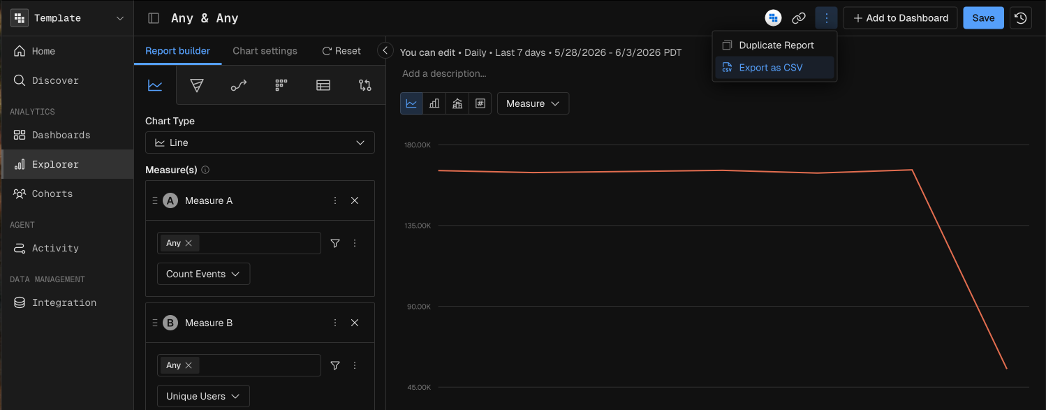
Export to CSV
Export the report data as a CSV file from the options menu (three-dot icon in the chart header). The export is generated server-side and downloaded directly.
MCP Prompt Examples
"Show me a table of event count by span name for the last 7 days, sorted by count descending"
"Create a report of daily active users by country — I only want to see the top 5 countries"
"Export the daily revenue data as CSV for the last quarter"